Home
Why Walt Disney World Road Signs Are Changing and How to Navigate the Property
Walt Disney World is currently undergoing a massive wayfinding rebrand, replacing the iconic purple and red road signs with a new navy blue, light blue, and yellow color scheme. This project involves over 1,000 signs across 27,000 acres and aligns with the modern aesthetic introduced during the 50th Anniversary. To navigate successfully, experts recommend prioritizing physical signage over GPS, as the property's road design is specifically engineered to manage high-volume traffic flow through a "bubble" system that often confuses standard digital maps.
What Is Happening to the Iconic Purple Walt Disney World Road Signs?
For nearly three decades, the sight of a vibrant purple sign with red and yellow accents was the first signal to visitors that they had officially entered the "vacation bubble." However, as of late 2026, this familiar sight is becoming increasingly rare. The transition to a new navy blue palette is one of the most significant visual changes to the resort's infrastructure since the early 1990s.
The scale of this project is immense. According to reports from Spectrum News 13 , there are more than 1,000 signs scattered across the 27,000-acre property. The rollout began in earnest in early 2022 and has continued steadily. While the initial spark for the change was the 50th Anniversary celebration, the new look is intended to be a permanent fixture of the resort's modern identity.
The new color scheme features a deep navy blue background, a light blue horizontal stripe at the bottom, and a combination of white and yellow text. This palette is designed to feel more "regal" and sophisticated, moving away from the primary-color-heavy Mickey Mouse palette of the previous era. While some fans feel a sense of nostalgia for the purple signs, the new design offers improved contrast and a cleaner look that matches the updated gateway arches and the reimagined Cinderella Castle.
How the New Blue and Yellow Signage Design Differs from the 1990s Classic
The shift in color is only the most obvious change. If you look closely at the new signage, you will notice several technical adjustments that alter how drivers process information. One of the most notable changes is the text alignment . The classic purple signs utilized left-aligned text, which is a standard in many wayfinding systems. The new blue signs, however, have shifted to centered lettering .
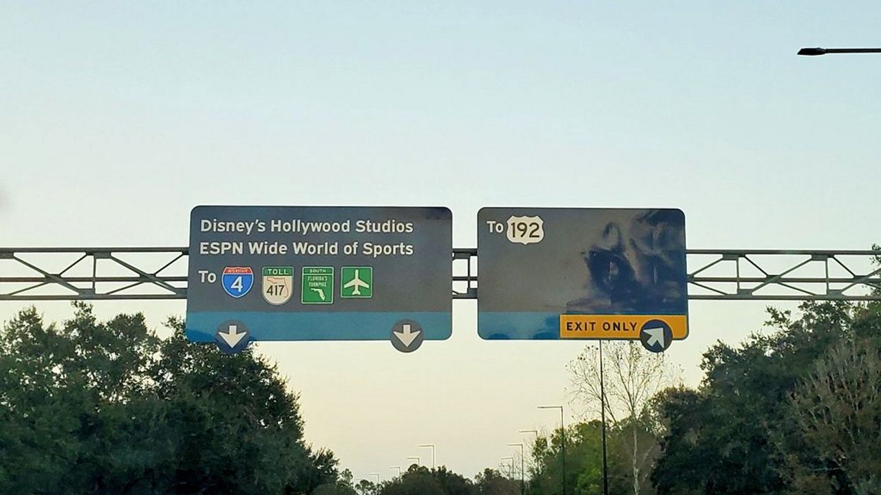
Image source: Spectrum News 13
Another significant update involves the branding of individual parks, specifically EPCOT. In the previous system, the park was often referred to as "Epcot" in sentence case. The new wayfinding system reflects the park's unified rebranding, displaying the name in all capital letters: EPCOT . This change aligns with the park's new "neighborhood" identity and its historical roots as an acronym for Experimental Prototype Community of Tomorrow.
Comparison of Signage Eras
| Feature | Classic Sign (1990s-2022) | New Sign (2022-Present) |
|---|---|---|
| Primary Color | Purple | Navy Blue |
| Accent Colors | Red / Yellow | Light Blue / White / Yellow |
| Text Alignment | Left-Aligned | Centered |
| EPCOT Casing | Epcot | EPCOT |
| Design Inspiration | Mickey Mouse Palette | 50th Anniversary / Modernism |
Design enthusiasts have also noted changes in the spacing and font weights. While the font remains highly legible—often cited as a variation of Sassoon Primary—the centered alignment on the new signs creates a more formal, symmetrical appearance. Some wayfinding experts argue that centered text can be slightly more difficult to read at high speeds compared to left-aligned text, but the high-contrast white-on-navy color choice helps mitigate this effect.
A Brief History of Disney World Wayfinding Since 1971
It is a common misconception that the purple signs have been around since the Magic Kingdom opened in 1971. In reality, the first two decades of Walt Disney World featured much simpler, utilitarian signage. These early signs were often brown or green, resembling standard highway markers rather than a themed experience. The goal was functional, but it lacked the "Disney touch" that defined the parks themselves.
The "Purple Era" began in the 1990s when Disney hired the Los Angeles-based graphic design firm Sussman/Prejza . This firm was already famous for its work on the 1984 Los Angeles Olympics. Their mission was to create a seamless transition from the outside world into the Disney "bubble." By using a unique color palette of purple, red, and yellow, they ensured that guests knew exactly when they were on Disney property without needing to see a logo.
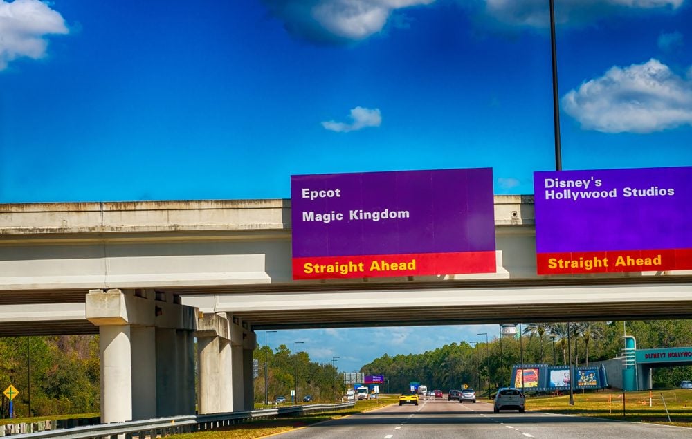
Image source: Reader's Digest
This design was so successful that it was exported to Disneyland Paris (originally Euro Disney) to provide a consistent global brand identity. For thirty years, these signs were a staple of the Florida landscape. The decision to move away from this iconic look was not taken lightly; it represents a broader shift toward a "Disney Modern" aesthetic that favors clean lines and a more unified, corporate-regal color palette across all four theme parks and dozens of resort hotels.
Why You Should Trust the Road Signs Over Your GPS on Property
In the age of smartphones, it is tempting to rely solely on Waze or Google Maps. However, veteran Disney travelers and Cast Members often advise against this once you pass under the gateway arches. The road system at Walt Disney World is designed with a specific logic that digital maps often fail to grasp. This is sometimes referred to by fans as the "M.C. Escher" effect.
According to community discussions on DISboards , one of the biggest challenges for GPS is the lack of traditional intersections. Disney roads are engineered to keep traffic moving, which means many "turns" are actually long, sweeping flyovers or cloverleafs. If you miss a turn, your GPS might suggest a U-turn that isn't legally or physically possible for another three miles. Following the physical signs ensures you are placed in the correct lane well in advance of these complex maneuvers.
Furthermore, Disney frequently updates road configurations for new expansions, such as the Western Way extension or the World Drive bypass. Digital maps can lag behind these changes by several months. The physical signs are always the most accurate reflection of the current traffic patterns. Experts suggest "eyes on the road, not the phone" to avoid the 30-minute detours that a single wrong turn can cause on the vast property.
Understanding the Difference Between Guest and Backstage Signage
Not every sign at Walt Disney World is meant for you. One of the keys to successful navigation is recognizing the hierarchy of signage. The branded navy blue (or remaining purple) signs are Guest-Facing . These are designed to be beautiful, legible, and helpful for tourists. If you see a sign that looks like a standard, plain street sign, you might be heading somewhere you don't belong.
Cast Member Signage is typically utilitarian. Signs for "Pluto Parking," "Center Dr," or "Maintenance Bay" are indicators that you have entered a backstage area. These areas are not themed and often lead to industrial zones, warehouses, or employee-only entrances. If you find yourself following a sign that lacks the light blue accent stripe or the iconic Disney font, it is a strong signal to safely turn around at the next opportunity.
A prime example of this is the Reams Road entrance . While it is a legitimate way to enter the property, it is primarily used by Cast Members and locals. The signage here is much smaller and less ornate than the massive gateway arches found on World Drive or Hotel Plaza Blvd. Understanding these visual cues helps maintain the "magic" of your trip by keeping you on the intended guest paths.
Where to Find the Last Remaining Purple Road Signs Today
If you are a fan of the classic aesthetic and want to capture a photo before they are gone forever, you need to act quickly. The replacement process is moving fast, particularly on major thoroughfares like Osceola Parkway and World Drive. However, there are still "pockets" of nostalgia if you know where to look.
- The EPCOT Resort Area: As of recent reports, several purple signs remain near the entrances to the BoardWalk, Yacht & Beach Club, and Swan & Dolphin resorts.
- Secondary Backroads: Roads that connect the main parks to smaller utility areas or older resort wings often retain the purple signs longer than the high-traffic tourist routes.
- Victory Way: This stretch near the Art of Animation and Pop Century resorts has seen a mix of old and new, making it a great spot to see the transition in real-time.
It is also worth noting the evolution of the Gateway Arches . The main entrances to the resort were among the first to be updated. The tagline was changed from the long-standing "Where Dreams Come True" to "The Most Magical Place on Earth." These arches now feature the same navy blue and gold palette, serving as the definitive visual anchor for the new era of Disney wayfinding.
How to Buy or Create Your Own Disney World Road Sign Replicas
The nostalgia for the purple signs has created a thriving secondary market. While Disney rarely sells decommissioned road signs to the public—they are typically scrapped or archived for safety and legal reasons—independent artists have stepped in to fill the void. You can find a wide variety of replicas on platforms like Etsy and eBay.
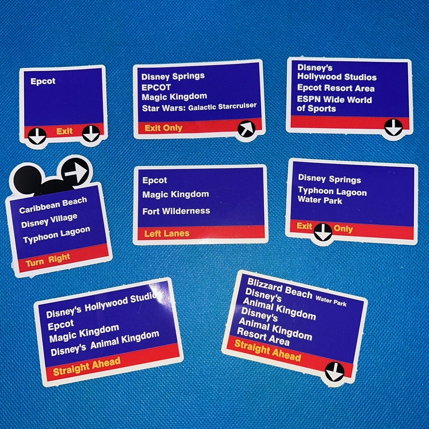
Image source: Etsy
Price points for these items vary significantly based on quality and scale:
- 3D-Printed Minis ($20 - $40): These are perfect for desks or bookshelves and often replicate specific park exits.
- Hand-Painted Wood Replicas ($50 - $100): These offer a more rustic, artisanal feel and are popular for home theaters or game rooms.
- Full-Scale Custom Metal Signs ($150+): Some shops offer custom-made aluminum signs that match the exact dimensions and reflective properties of the real road markers.
When shopping for replicas, look for sellers who mention the specific 1990s color codes or the Sassoon Primary font to ensure the highest level of accuracy. These pieces have become a top-tier choice for Disney collectors who want to preserve a piece of the resort's history that is rapidly disappearing from the physical landscape.
Frequently Asked Questions
Why is Disney World changing its road signs?
The change is part of a broader brand modernization effort that began with the resort's 50th Anniversary. The new navy blue and gold palette aligns with the updated look of Cinderella Castle and the main gateway arches, creating a more cohesive and "regal" visual identity across the entire 27,000-acre property.
What font is used on the Disney World road signs?
While Disney does not officially disclose its proprietary fonts, the signage is widely considered to be a customized version of Sassoon Primary . This font was chosen for its exceptional legibility, which is critical for drivers navigating complex intersections at high speeds.
Are the purple signs gone forever?
Yes, the transition is intended to be permanent. While the rollout takes several years due to the sheer number of signs, the purple and red scheme is being systematically phased out. By the end of 2026, it is expected that only a few isolated examples will remain in low-traffic or backstage areas.
Can I buy an original purple road sign?
Authentic, decommissioned signs are extremely rare on the public market. Disney typically destroys old signage to prevent them from being used for unauthorized purposes or creating confusion. Most "authentic" signs found online are high-quality replicas rather than property-used originals.
Is driving in Disney World difficult for first-timers?
It can be challenging due to the unique road layouts that prioritize traffic flow over traditional intersections. However, if you follow the color-coded signs and stay in your lane, it is a highly manageable experience. The key is to trust the physical signs over your GPS once you are on property.
The Bottom Line on Disney Wayfinding
The evolution of Walt Disney World road signs marks the end of a nostalgic era and the beginning of a modern, unified brand identity. Here are the key takeaways for your next trip:
- Follow the blue signs as they represent the most current and accurate navigation data on property.
- Look for "EPCOT" in all caps to identify the newest additions to the wayfinding system.
- Prioritize physical signage over GPS to avoid common navigation traps like impossible U-turns.
- Distinguish Guest vs. Backstage by looking for the light blue accent stripe and themed fonts.
- Visit the EPCOT Resort area soon if you want to see the last remaining purple signs.
- The "Most Magical Place on Earth" is now the official greeting on all updated gateway arches.
Next time you drive through the gateway arches, take a moment to appreciate the design psychology that keeps the "Most Magical Place on Earth" moving smoothly.